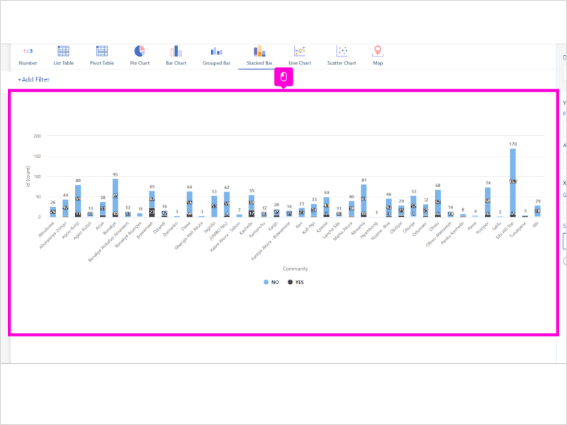
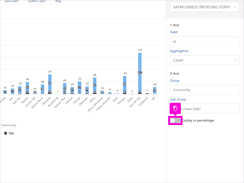
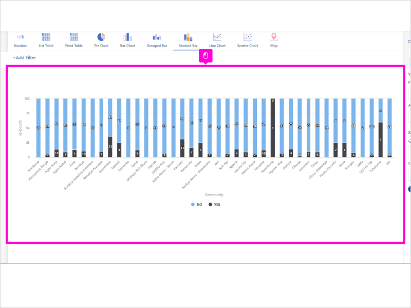
To create a stacked bar chart:
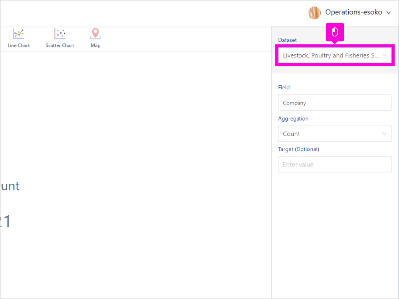
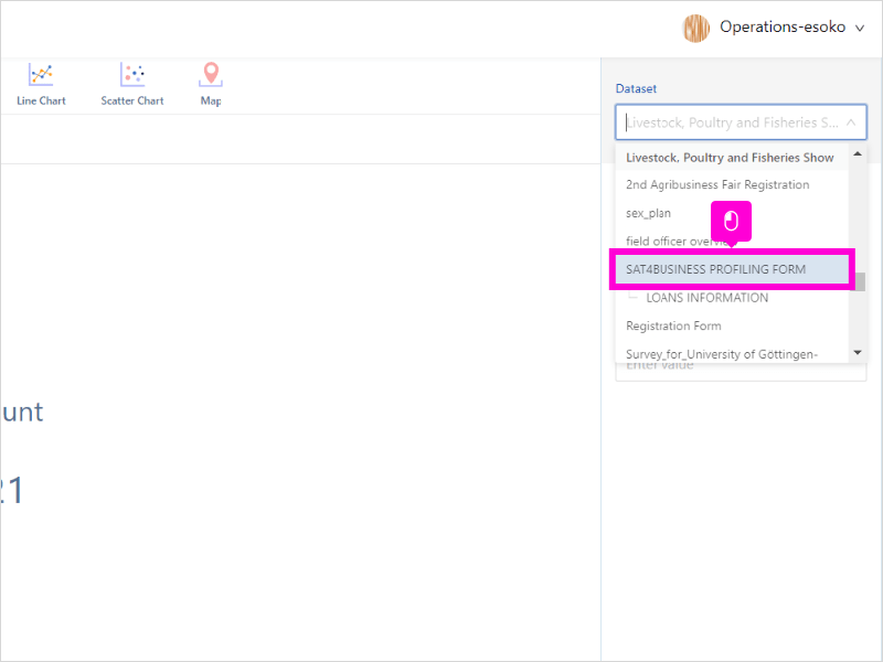
- Select your preferred dataset
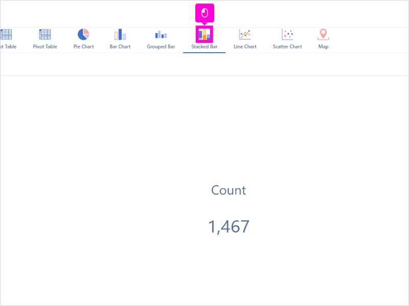
- Click Stacked Bar
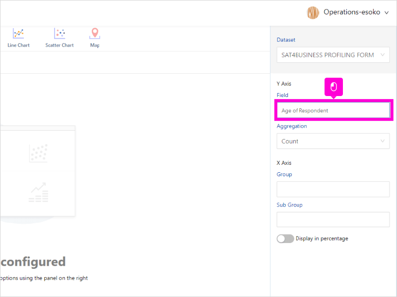
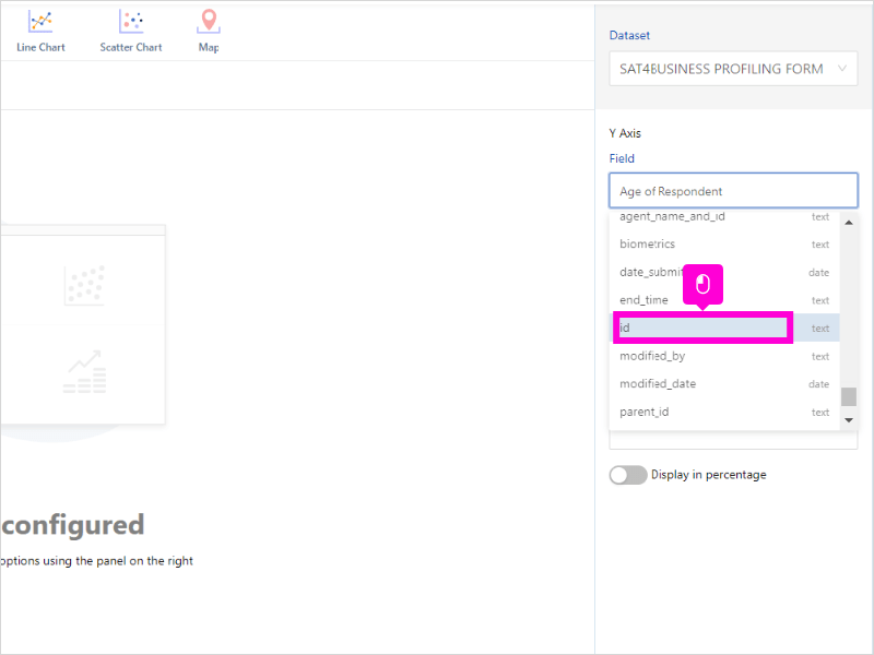
- On the Y-Axis, select Field as id. Each response has a unique id
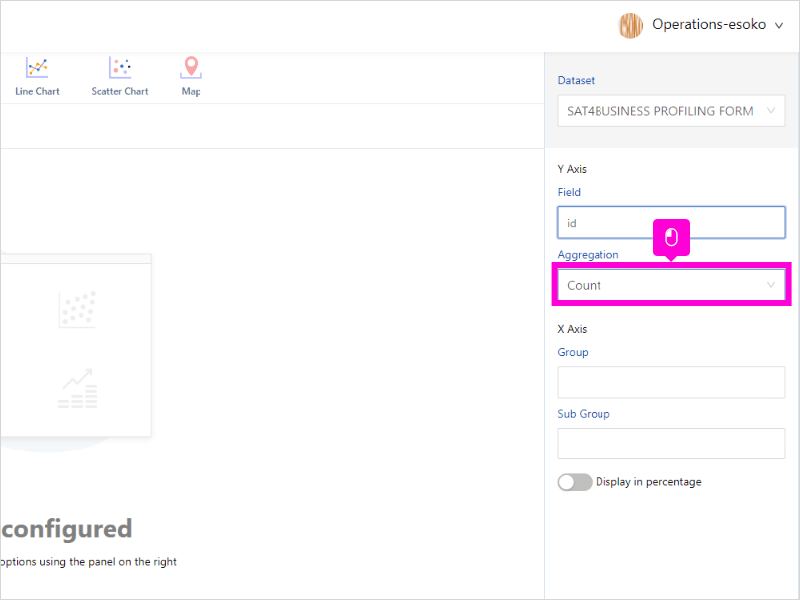
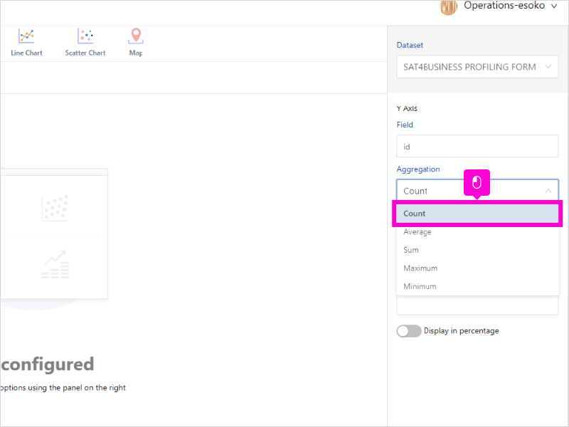
- Select Aggregation on the Y-axis as count
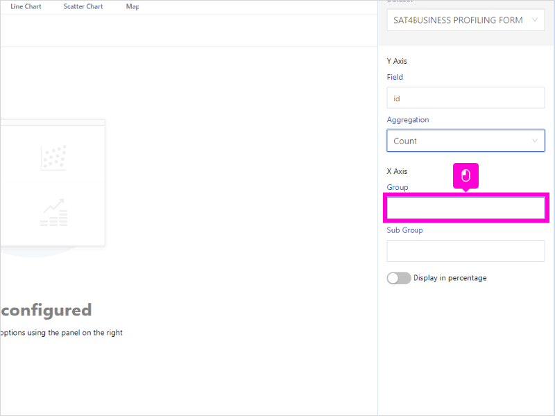
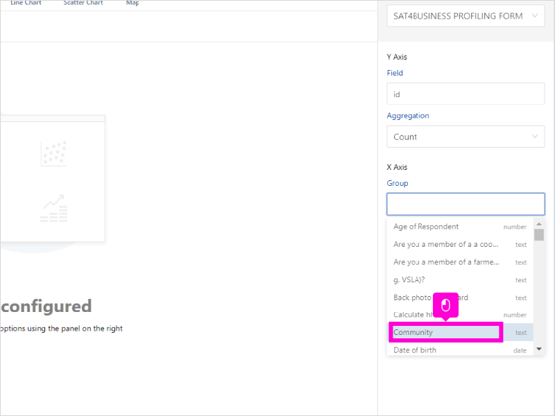
- On the X-Axis, select which data Group you want to visualize
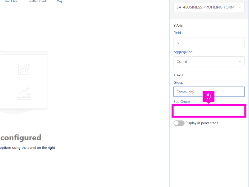
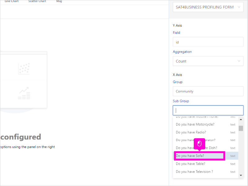
- Select which data subgroup you want to visualize
- Enable Display in percentage to display data in percentages
15 STEPS
1. The first step is to open Insyt Analytics and click highlight
2. Click highlight
3. Click highlight
4. Click highlight
5. Scroll and click id
6. Click Count
7. Click highlight
8. Click highlight
9. Click Community
10. Click highlight
11. Scroll down and click Do you have Sofa?
12. Click highlight
13. Click highlight
14. Click highlight
15. That’s it. You’re done.
Here’s an interactive tutorial
** Best experienced in Full Screen (click the icon in the top right corner before you begin) ** https://www.iorad.com/player/1945832/Analytics-Esoko—How-to-untitled-task-name
Was this article helpful to you?
Yes
No