Visualize categorical data with rectangular bars with heights proportional to the values that they represent.
To use the bar chart:
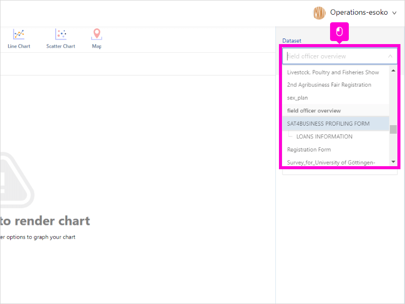
- Select your preferred dataset
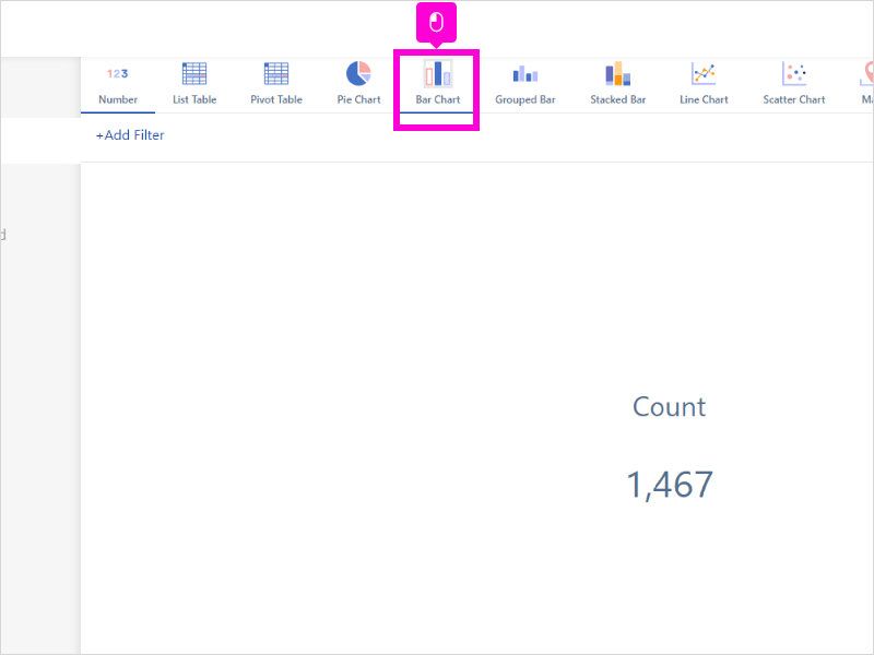
- Click Bar Chart
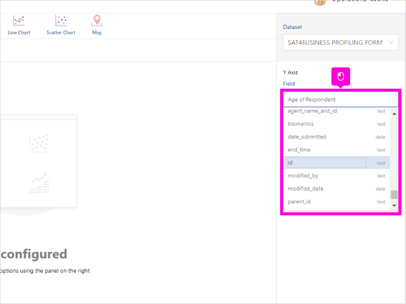
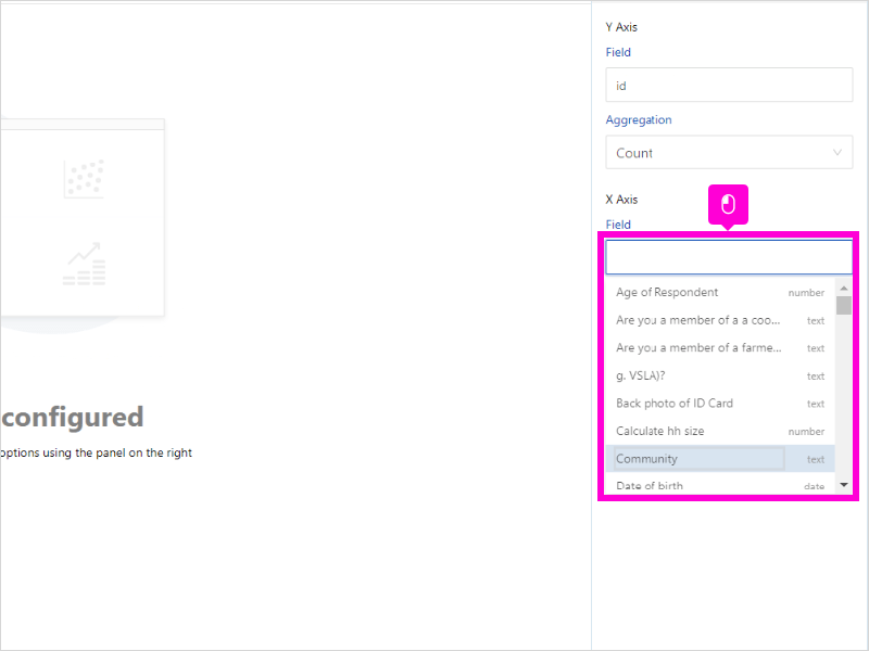
- On the Y-Axis, select Field as id. Each response has a unique id
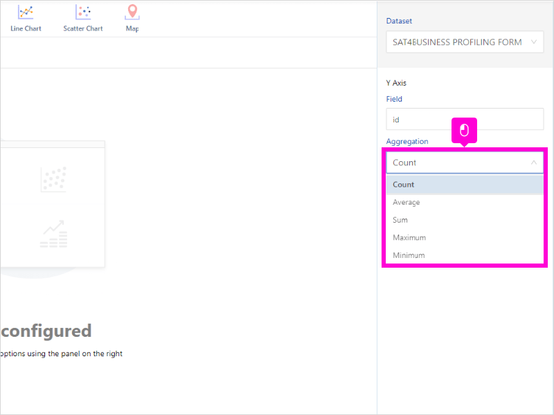
- Select Aggregation on the Y-axis as count
- On the X-Axis, select which Field you want to visualize
9 STEPS
1. Select your preferred dataset
2. Click Bar Chart
3. On the Y-Axis, select Field as id. Each response has a unique id.
4. Select Aggregation on the Y-axis as count
5. On the X-Axis, select which Field you want to visualize
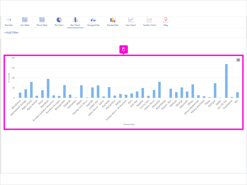
6. You have created a bar chart
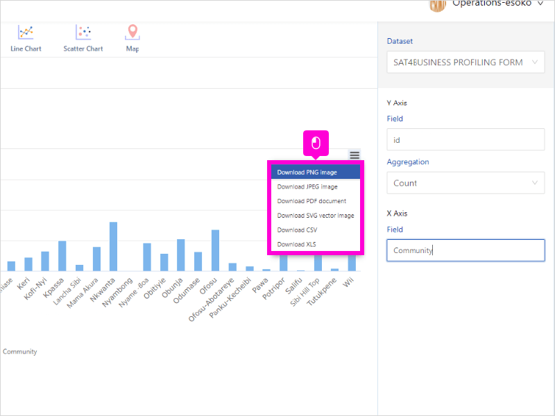
7. Click Menu to download the chart in several formats including PNG, JPEG and PDF
8. Open insyt.esoko and click highlight

9. That’s it. You’re done.

Here’s an interactive tutorial
** Best experienced in Full Screen (click the icon in the top right corner before you begin) ** https://www.iorad.com/player/1945822/Analytics-Esoko—How-to-untitled-task-name
Was this article helpful to you?
Yes
No