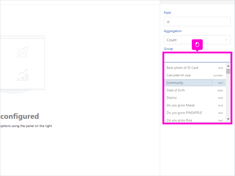
Organize data into slices to illustrate numerical proportion and relative sizes of data
To use the pie chart
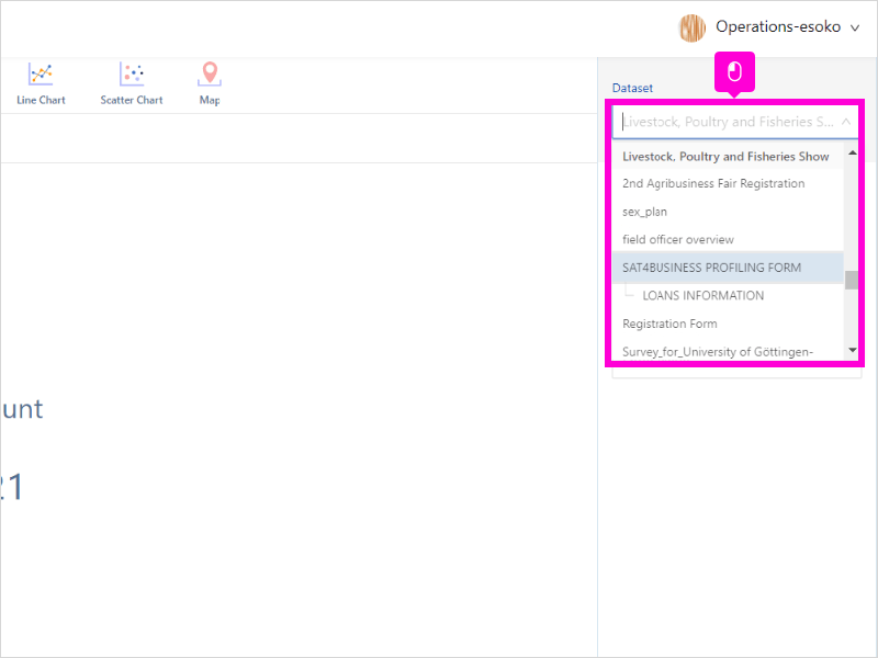
- Select your preferred dataset in the right-hand side panel
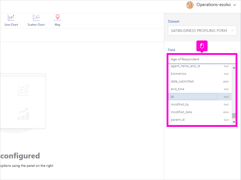
- Select Field as id. Each response has a unique id
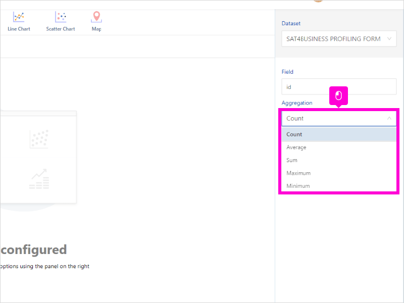
- Select Aggregation as count
- Select which data group you want to visualize
7 STEPS
1. The first step is to select your preferred dataset
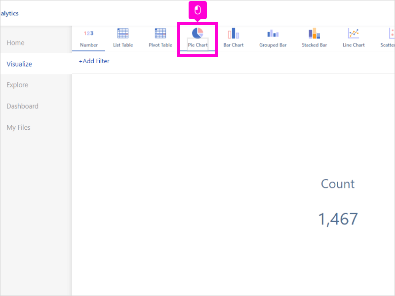
2. Click Pie Chart
3. Select Field as id. Each response has a unique id
4. Select Aggregation as count
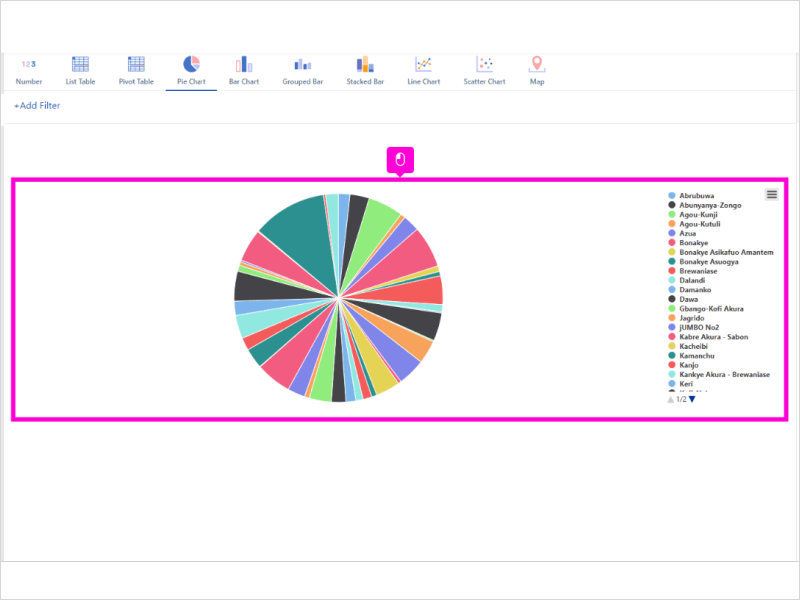
5. Select which data group you want to visualize
6. Your pie chart is ready
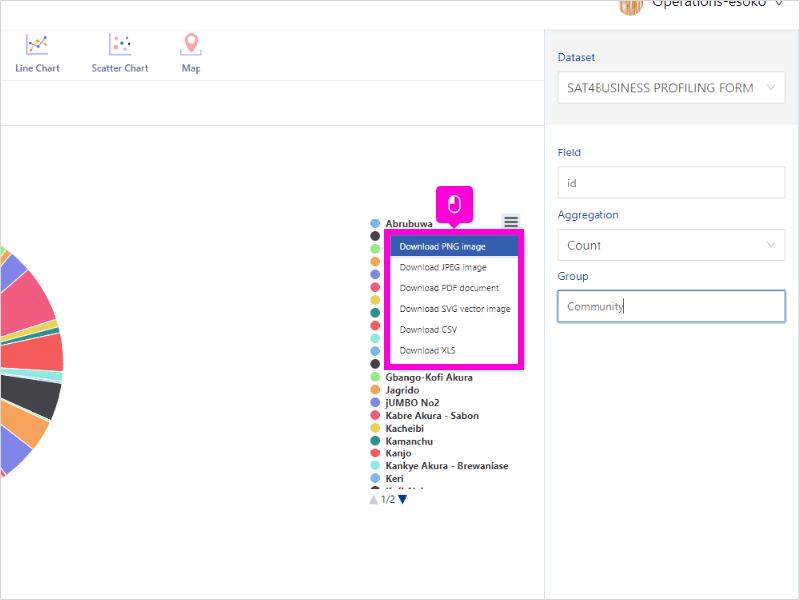
7. Click the menu bar for several options for download including PNG, JPEG, PDF etc
Here’s an interactive tutorial
** Best experienced in Full Screen (click the icon in the top right corner before you begin) ** https://www.iorad.com/player/1945820/Analytics-Esoko—How-to-untitled-task-name
Was this article helpful to you?
Yes
No